
Case Study
Burgwedges
How might we improve the food ordering experience of people?
Project type
Google Ux Design Bootcamp
As part of the Google Ux Design professional program, I worked on this project and completed it by receiving feedback and suggestions at every stage from peers all over the world.
Project duration
6 weeks
( 15-03-2021 - 30-04-2021)
Role
Indvidual
- Management (sprint planning and weekly reviews)
- UX analysis (empathize, define, ideate)
- Design (mobile app)
- Prototyping (basic flow and interactions)
About the business
Burgwedges is a chain of fast-food restaurants headquartered in New Delhi, India. Presently there are four restaurants of Burgwedges located in the heart of Delhi.
The major selling products of Burgwedges are burgers and sandwiches. It is a favorite place for college-going students as the location of the restaurants plays an important role in grabbing their attention. Its beautiful interior, affordable price, and amazing food presentations steal the hearts of its customers.
About the project
In this project, we present “Burgwedges” a smartphone application that solves some of the major problems faced by users by integrating features and services to help people save time, money and create a memorable buying experience.
The problem
How might we improve the food ordering experience of Burgwedges customers?
Although Burgwedges restaurant sells lip-smacking fast food at an affordable price and its location and aesthetically pleasing interior attracts people from nearby areas, the ordering experience has not yet advanced with time.
1. A lot of customers still face inconvenience in customizing their orders.
2. Customers spend time in queues to order food which is frustrating as well as risky after the fallout of covid 19.
3. Delay in-home delivery orders.
4. Lack of healthy meals for health-conscious people.
The Solution

Test
Prototype
Empathize
Define
Ideate
A fast-food ordering application where customers can order from anywhere, customize their order, check the nutrition value of every item and get the fastest delivery.
Stage 1 : Empathize
Kickstart
I initially started, understanding the business and user goals with the following questions
1. What should we build and why?
2. What are the user problems?
3. How can we solve them?
Competitive-audit
Competitive-audit: was done to get an overview of competitors strength and weakness

User Interviews
The aim was to get a detailed overview of people who have dining and ordering experience from Burgwedges. Online interviews were conducted with the aim to ask open-ended questions.
Findings (Quantitative)


85% of people complained about getting the wrong order.
75% of people find it difficult to stand in queues to place their order.
75% of people say that Burgwich has a pleasing interior.
85% of people say that Burgwich is affordable
90% of people would love to customize their orders.
Stage 2 : Define
Empathy maps
The collected data was analyzed and synthesized to create Empathy maps. Certain patterns were observed and based on the patterns, three types of users were identified from the analysis.
Later, empathy maps were created to understand their needs, behaviours and motivations.

SAYS
THINKS
DOES
FEELS
PRIYAL
Meet the Users
User personas were created to get a clear understanding of user pain points and goals which helped to bridge the gap between what business thinks the users needs and what the users actually need.


User stories
They were written to inspire and inform design decisions.
USER A
"As a hungry college student who is tired after attending class, I want to order in-store through a smartphone app so that I can satisfy my hunger with minimal delay in time
"
USER B
"As working professional thinking to take home snacks for his kids after office, I want to place and track my order so that I better my time arrival and minimize waiting time
"
Problem statements
Priyal is a student who wants to receive orders without leaving her table because she is tired and wants to avoid standing in queues to place her order. She also wants to customize her orders as she is allergic to mint.
Rajesh is a busy software trainer who needs to place, track and take away orders for his kids because he wants to avoid waiting at the restaurant and also customize his order.
USER C
"As a health enthusiast, I want healthy food options and check the nutrition value of items so that I can have fast-food based on my diet plans
"
Amit is a health enthusiast who wants healthy food options for himself and wants to check the nutrition value of every item so that he can compare and have meals based on his diet plans.
Journey map
To know how will the user is going to interact with the smartphone application, journey maps were created. This helped me to step into users' shoes and see the product from their perspective.


User flow
To understand and anticipate cognitive patterns of users, user flow was made to display the complete path a user takes when using the Burgwedges application.
Stage 3 : Ideate
Crazy eight and Storyboards
Crazy eight and storyboards were the tools to brainstorm the potential solution of the problem stated and beyond.


STAGE 4 - Prototype
Low fidelity mockups

Medium fedility mockups


STAGE 5
Usability test
To know how will the user is going to interact with the smartphone application, journey maps were created. They were used to extract touchpoints.
Plan
Research
Analyse
Synthesis
Study type - Unmoderated usability study
Participants : 5
Location - India, Remote
Length : 30 minutes
Themes and Insights
1. Based on the theme, users want to have real images of items displayed on the screen, I have provided bigger images covering the screen.
2. Users want a way to move back to any desired screen while customizing their order, and a breadcrumb navigation menu has been provided on screens
Changes were made based on the insights.
.png)

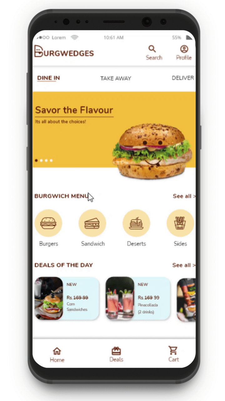
Meet Burgwich
A platform that enhances the food ordering
experience of people.
Let's Get Started
-
The primary goal of the user is to order meals that have been taken care of by providing icons of four categories of food items. It's a quick way to save their time if they already know what they want to order.
-
Offers and discounts have been provided to grab customer attention.
-
Users can easily navigate through the bottom navigation bar as that is easily reachable by a human thumb.
-
Users can choose dine-in, take away, or delivery option to order wherever they want


Customize your meals
The users can customize any item and any ingredient. They also get various healthy ingredients that can be replaced to make their meals nutritious.

With easy to interact interface users will enjoy ordering their meal and get it at their doorstep within minutes. They can track their order and contact the delivery person as well.

Users can check the nutrition value (fats, proteins, calories) of every item and order based on their diet plans.
Check the nutrition
User flow - Customize order
How it works?
Users can easily customize their meals by using customize option. They can choose their bread, patty, salad, and sauce. Users can wear their chef aprons and get a feeling of preparing their own meal. Crazy, Isn't it?
Usability test
After completing high-fidelity prototype, we have moved on to two more usability tests to iterated on the designs.
Study type - Unmoderated usability study
Location - India, Remote
Participants : 5
Length : 30 minutes
Next Step : We are working on the project to craft a strong and peaceful experience. Few insights helped us to scale the project. Changes are coming shortly. Stay tuned:)
Accessibility considerations
1
Uncluttered screen
Consistent navigation
Plain language
A well-thought layout helps people with temporary or permanent cognitive disabilities to understand the information easily.
2
Colors
According to web accessibility guidelines given by W3C ( World wide web consortium), the minimum contrast ratio of colors should be greater than 4.5:1.
This helps people with color blindness or low visibility.

Icons with supportive text are easy to understand
Easy language
Uncluttered screen
.png)
.png)
WCAG: Web contrast accessibility guidelines - Minimum contrast ratio = 4.5:1
Sticker sheet
3
Alternative text
Alternative text is easily read by screen readers to help people with visual impairment.

Alt-text: Spicy chicken patty burger with tomato, onion, lettuce, and barbeque sauce.

Retrospective
What did I learn?
Special mentions
-
Peers are gems. They helped me improve my designs.
-
Thanks to my mentors Michael Dedrick, Shabnam Kashani, Emily Schlemmer, Kartik Rao, Paolo Malabuyo, Karen Ng, Dane Galbraith, and Juan Angustia.
-
Feedbacks make all the difference. They help us to make well-informed design decisions. I have realized that the more you iterate, the better it becomes. Every iteration made me witness the growth of experience that I was trying to weave.
-
I have learnt a lot during the process. Especially, the accessibility consideration which was new and insightful for me.
-
If we design for the disabled, it is going to help everyone eventually and that's the best part about it.